Increasing Virtual visits
A client in the pelvic floor physical therapy space came to me with a need for increasing virtual visits to quickly scale their business. The target audience was women and people with vaginal anatomy ages 25-45. Pelvic Floor Physical Therapy worked to solve pelvic floor issues, such as; postpartum recovery, bladder, and bowel controls, painful sex, and separated abs.
I was excited to tackle this opportunity, but creating solutions was challenging because of inadequate education about pelvic floor physical therapy. It was challenging to get women and people with vaginal anatomy to sign up for something they didn't know existed or how it could help their daily issues.
Role
UX Designer
Platforms
Mac OS
Figma
Timeframe
Overall: 12+ weeks
Discovery & Research: 4+ weeks
Design & testing: 8 weeks
How might we scale our business more quickly by increasing virtual visits?
User Research
I set up a meeting to talk with the stakeholder to get a better understanding of what the problem was that I was solving. It became clear that the stakeholder had already decided what the problem was and what the next course of action would be. The project summary I received said How might we scale our business more quickly by increasing virtual visits?
After meeting with the stakeholders, I decided that conducting interviews was the most effective and efficient research method because I wanted to gain my own understanding of what the problem was and how to resolve the issue. The stakeholder provided eight participants, and I was able to schedule interviews with six. Of the six participants, three were stakeholders, three were current users.
I was most curious about what the stakeholders thought prevented users from signing up for virtual visits. I also was interested to know what motivating factors for the users to book appointments and what they wished they would have known coming into pelvic floor physical therapy.
The interviews did not disappoint. First, I created an affinity map from the stakeholders to help organize and synthesize the data into four categories; Process, Education, Virtual v. In-person & Marketing. Next, I did the same for the users, and I came up with Expectations, Improve my PT Experience, Improve my Health, & Communication.
This information led to changing my approach to the problem. From the user and stakeholder interviews, I asked How might we design an effortless sign-up process that empowers new users to book a virtual appointment?
User Journey
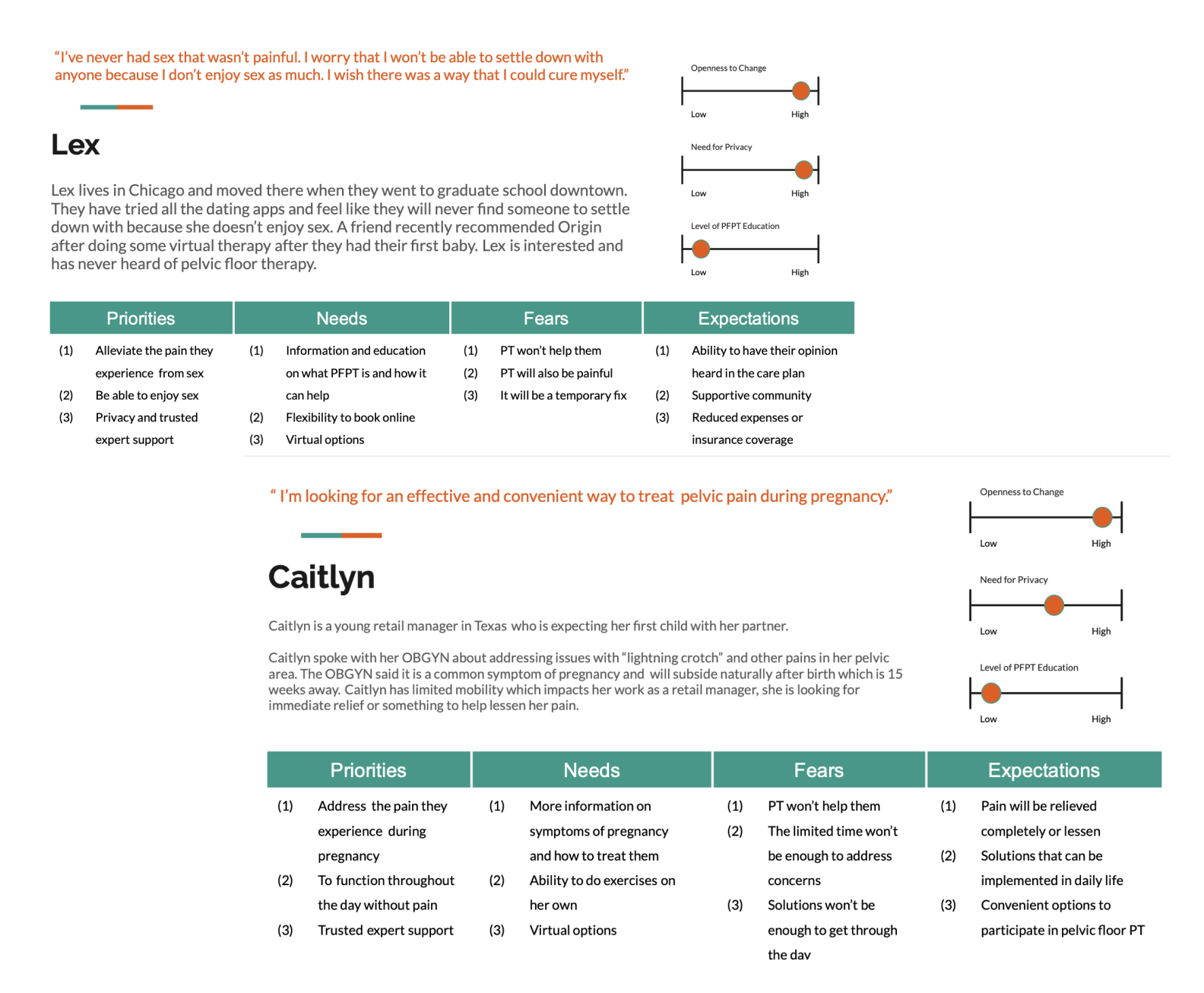
Referring back to the interview quotes/affinity map, I created user personas. The personas were used to gain a better understanding of the user and their problems. I made three user personas to take myself out of the space of what I wanted for the user. As a designer, it's easy to get caught up in what you think the user needs and not what the need is. The personas allowed me to step outside and think about the problem from a different perspective.
I provided priorities, needs, fears, and expectations for each persona, including; how open they were to change, their need for privacy, and the level of pelvic floor physical therapy.
As I was working, I noticed that many of the issues for these personas stem from a lack of education surrounding pelvic floor physical therapy. The lack of education affected the design significantly because the business wanted to increase virtual visits. Still, the question was, how does the business increase something that most people don't know exists?
From the personas I created, this led to empathy maps. I took what the personas said and incorporated them in the empathy maps. The empathy maps informed me of what the user would say, what they thought, their actions, and how they felt. This influenced the design as I was able to create steps for the user journey maps based on the data from the users thoughts, emotions, and actions.
User Journey
I worked on user journey maps to better understand the user's goals and how they related to the business goals. For example, the most crucial user goal was to book a virtual visit because it was the same as the business' goals. I determined the steps of the user journey by implementing pieces of the empathy map created from quotes from the users. The user journey mapping helped me design a better product because it gave me the full scope of the user's point of view. I looked at the problem and ask what would help this user meet their need.
UI Mockup
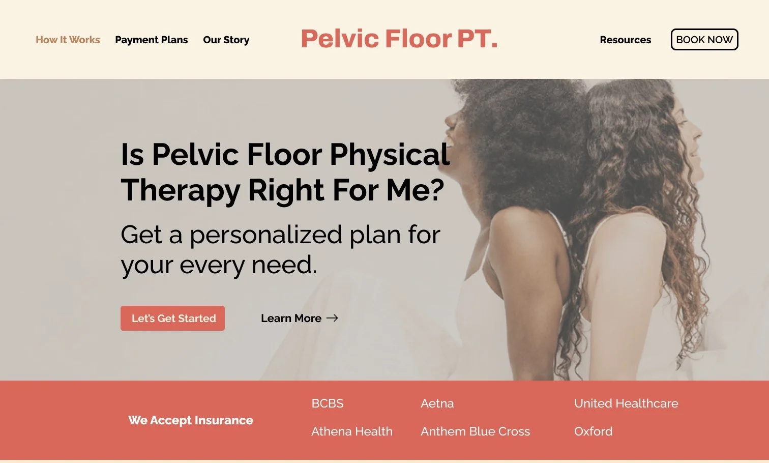
Using my learnings from the low fidelity wireframes, I designed the final screens in Figma. I followed the design system the client had already established. I tweaked the navigation to a more straightforward design, but the rest utilized the style already in place. I designed this as responsive for desktop, tablet, and mobile and simplified the design of the navigation and information architecture. Based on my assumption that there were too many words, the hero section and navigation I proposed will likely help the users as it is easy to follow.
Based on the user feedback received during user testing I:
Added a page to learn more
Added a descriptive image to learn more
Deleted the screen of the guide introduction and went directly to the information page.
Unfortunately, I did not have enough information to add as many content-specific details, but this is an excellent future recommendation.
Final Design
As a result, I designed an interactive learn more quiz, which solved the client's business problem and resulted in an educational experience for the end-user/consumer
What I learned
Speak Up
As I worked on this project, making design decisions and communicating those decisions with my team and the stakeholders were challenging. I relied on references, the design system, and intuition during this time. I reassured myself by ensuring data and design principles supported any decision I made.
missed Segments
Towards the end of the project, as I was iterating the prototypes, I realized that I did not have data from any target users who had not encountered pelvic floor physical therapy. While I had a pretty good idea of what those users would need, I worked quickly to gather three new users and interviewed them to confirm the how might we statement.
The Design Process isn’t always linear
As much as I would like to have a clear path to the answer, sometimes its anything but clear. I also learned that's where the real answers to the problems are.


